Master Tetradic Color Schemes for UI/UX Design (7 Expert Tips)

Master Tetradic Color Schemes for UI/UX Design (7 Expert Tips)

10

10

min read

min read

Share:

Author:

|

Content

Founder of

Min read:

10

Share:

“Modern SaaS dashboard illustrating tetradic color theory with floating UI cards, balanced warm and cool palettes, accessibility indicators, and a designer reviewing interface color systems.”
Summary

Tetradic color schemes use two complementary color pairs to create vibrant, balanced UI designs that improve visual hierarchy, accessibility, and brand consistency. When applied strategically with a dominant color, controlled saturation, and neutral support, tetradic palettes enhance contrast and user focus. This guide explains how designers can use advanced UI color theory to build engaging, scalable SaaS interfaces in 2026.

Your Product Might Be Losing Deals Before Sales Even Gets a Chance.Free App Competitiveness Audit.

Summary

Tetradic color schemes use two complementary color pairs to create vibrant, balanced UI designs that improve visual hierarchy, accessibility, and brand consistency. When applied strategically with a dominant color, controlled saturation, and neutral support, tetradic palettes enhance contrast and user focus. This guide explains how designers can use advanced UI color theory to build engaging, scalable SaaS interfaces in 2026.

Building Security Tools SOC Analysts Can Navigate Under Pressure?

For designers looking to build engaging digital products, mastering advanced UI UX color theory is essential. One of the most dynamic yet challenging approaches is the tetradic color scheme, a four-color system built on two complementary pairs. While it offers exceptional flexibility and depth, it requires careful balance to avoid visual overload. In this guide, we break down the fundamentals, common challenges, and seven expert techniques to help you confidently apply tetradic color palettes in modern web and SaaS design.


Foundations of UI/UX Color Theory for Tetradic Design

Before diving into the complexities of a four-color palette, it’s crucial to grasp the foundational principles of color theory. These concepts are the bedrock upon which all successful color schemes are built, helping you make intentional and strategic design choices.


Understanding the Color Wheel for Web Design

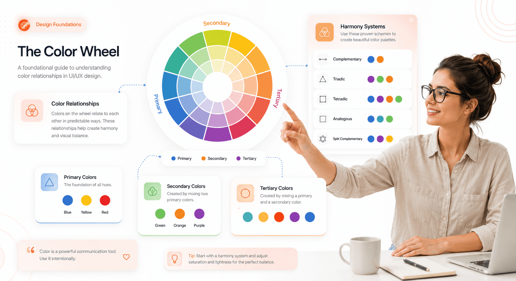
The color wheel is an illustrative model that organizes colors based on their relationships. It was first developed by Isaac Newton and remains an indispensable tool for designers today. It is typically composed of:


  • Primary Colors: Red, yellow, and blue. These are the fundamental colors from which all other colors are derived.


  • Secondary Colors: Orange, green, and purple. These are created by mixing two primary colors.


  • Tertiary Colors: These are created by mixing a primary color with an adjacent secondary color, resulting in hues such as red-orange, yellow-green, and blue-violet.


The wheel provides a visual guide for creating harmonious combinations. It helps you see how colors interact, whether they clash or complement each other, and how to build a palette that aligns with your design goals.

“Interactive SaaS-style color wheel showing primary, secondary, and tertiary colors with floating UI components and educational design system panels.”


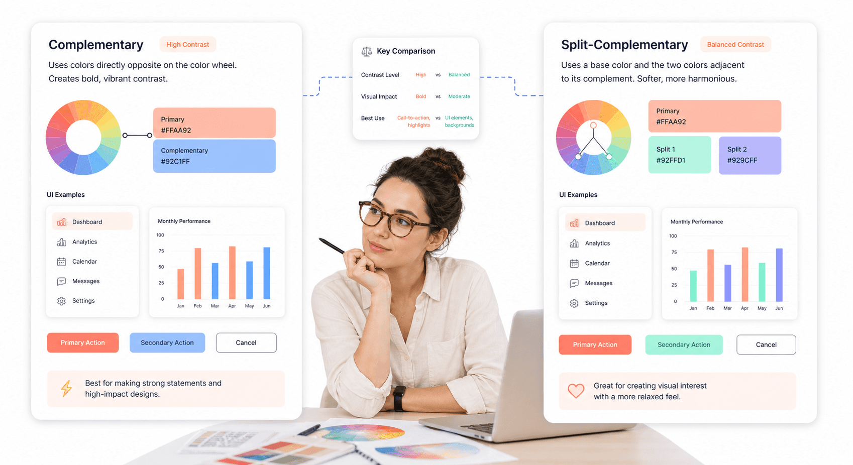
Complementary vs Split-Complementary Color Schemes

Understanding complementary colors is key to unlocking the power of the tetradic color scheme. Understanding complementary colors is key to unlocking the power of the tetradic color scheme — and is one of the essential UI/UX design terms every founder should know before commissioning a design system."


  • Complementary Colors: These are pairs of colors located directly opposite each other on the color wheel (e.g., red and green, blue and orange). When placed side-by-side, they create the highest level of contrast, making elements pop.


  • Split Complementary Colors: This scheme involves one base color and the two colors adjacent to its direct complement. It offers strong visual contrast but with less tension than a standard complementary pairing. We have many split-complementary color examples, such as red paired with yellow-green and blue-green. This creates a more nuanced and balanced look.

“Side-by-side comparison of complementary and split-complementary color schemes inside modern SaaS UI cards and interface components.”


How Tetradic Color Schemes Work in UI/UX

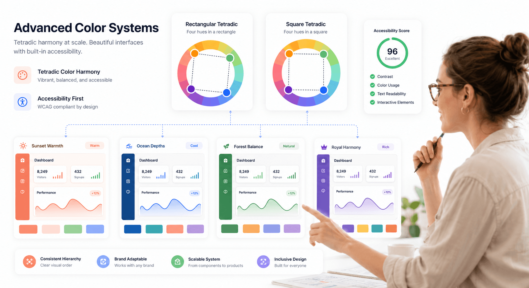
A tetradic color scheme is formed by selecting two pairs of complementary colors. These four colors form a rectangle on the color wheel. For instance, you might pair red and green with blue and orange.

What most guides skip: there are two distinct variations of the tetradic scheme. The rectangular tetradic places two colors closer together on one side of the wheel, creating a slight lean toward warm or cool tones, think vermillion, teal, amber, and indigo. The square tetradic spaces all four hues exactly 90 degrees apart, producing a more aggressive, high-energy balance red, yellow-green, blue, and red-violet is a classic example. Which variation you choose shapes the entire feel of your palette before a single color touches a component.


This structure inherently creates a rich palette with a natural balance between warm and cool tones, offering more creative freedom than simpler schemes like triadic or analogous.

“UI design visualization comparing rectangular and square tetradic color systems with connected color wheel layouts and dashboard examples.”


Benefits of Tetradic Color Schemes in UI Design

While more complex to manage, the tetradic color scheme offers significant advantages for digital product design, making it a popular choice for brands aiming for a modern and dynamic visual identity.


Creating Visual Depth and Interface Flexibility

With four colors at your disposal, you have a broader range to define different states, actions, and information hierarchies within your UI. You can assign specific colors to primary actions, secondary elements, notifications, and backgrounds without the palette feeling repetitive. This depth is especially valuable in complex applications, dashboards, and platforms where clear visual differentiation is critical for usability.


Enhancing Contrast and User Focus

The inherent structure of two complementary pairs creates a high level of natural contrast. This energy makes designs feel vibrant, engaging, and memorable. When balanced correctly, this contrast draws attention to key elements like calls-to-action (CTAs), highlights important information, and guides the user’s eye through the interface. It helps you build a visual narrative that keeps users engaged. This aligns with research from Nielsen Norman Group on visual attention and color, which shows users scan high-contrast affordances first.


Strengthening Brand Identity with Color

In a crowded digital marketplace, a unique color palette can make your brand instantly recognizable. Tetradic schemes are less common than simpler ones, allowing you to stand out. Research from the University of Loyola, Maryland, shows that color can boost brand recognition by up to 80%. Brands like Google and Slack have successfully used multi-color palettes to convey innovation, diversity, and user-friendliness. A well-executed tetradic palette tells a story of a confident, modern, and forward-thinking brand.


Common Problems with Tetradic Color Palettes

The richness of a tetradic color scheme is also its greatest challenge. Juggling four distinct hues requires a strategic approach to avoid creating a design that feels chaotic, unprofessional, or visually overwhelming.

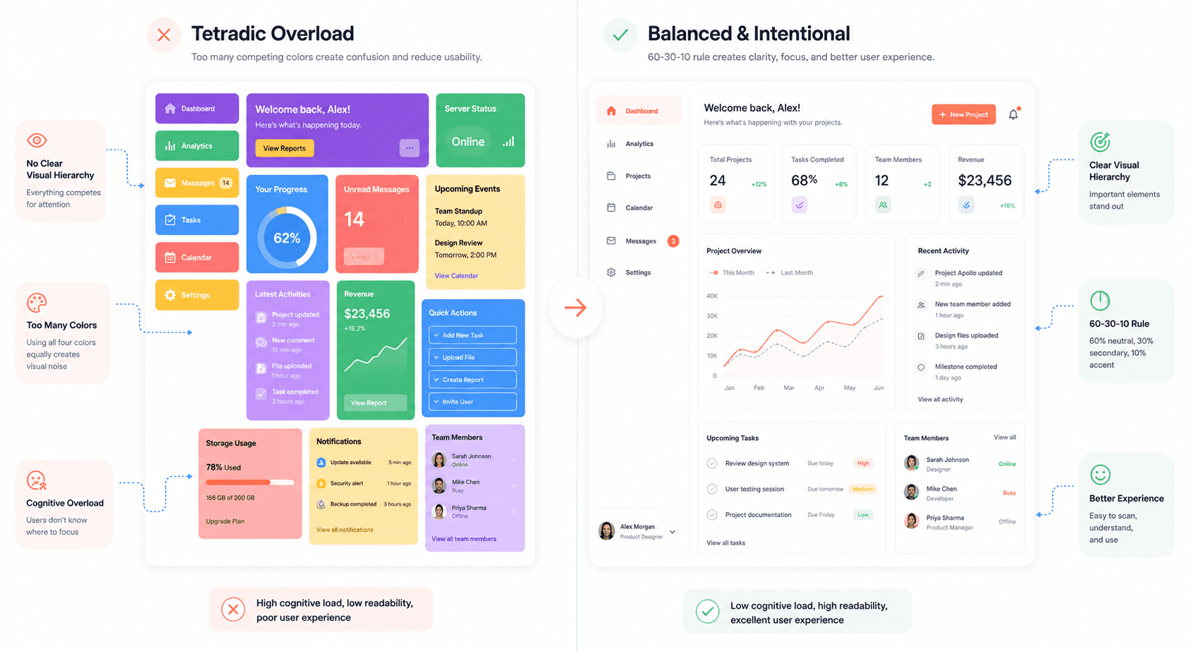
  • Visual Chaos: The most common pitfall is treating all four colors with equal importance. Without a clear hierarchy, the colors compete for attention, leading to a cluttered and confusing interface.


  • Poor Harmony: A lack of balance between warm and cool tones can create visual tension. An interface dominated by warm colors may feel aggressive, while one with too many cool tones might seem cold and uninviting.


  • Accessibility Issues: High-contrast colors, if used improperly, can lead to poor readability. Text and important UI elements might become difficult to discern, especially for users with visual impairments.


  • Brand Inconsistency: Without a clear system for applying the colors, the brand’s visual identity can become fragmented and inconsistent across different screens and platforms.


Addressing these challenges is not about limiting your creativity but about channeling it through a structured and intentional process.

“Split-screen SaaS interface showing cluttered tetradic color overuse versus balanced UI hierarchy using the 60-30-10 design principle.”


7 Expert Tips for Tetradic Color Palette Design

Here are seven actionable tips to help you harness the power of tetradic colors while maintaining balance, clarity, and professionalism in your UI/UX designs.


Choose One Dominant UI Color

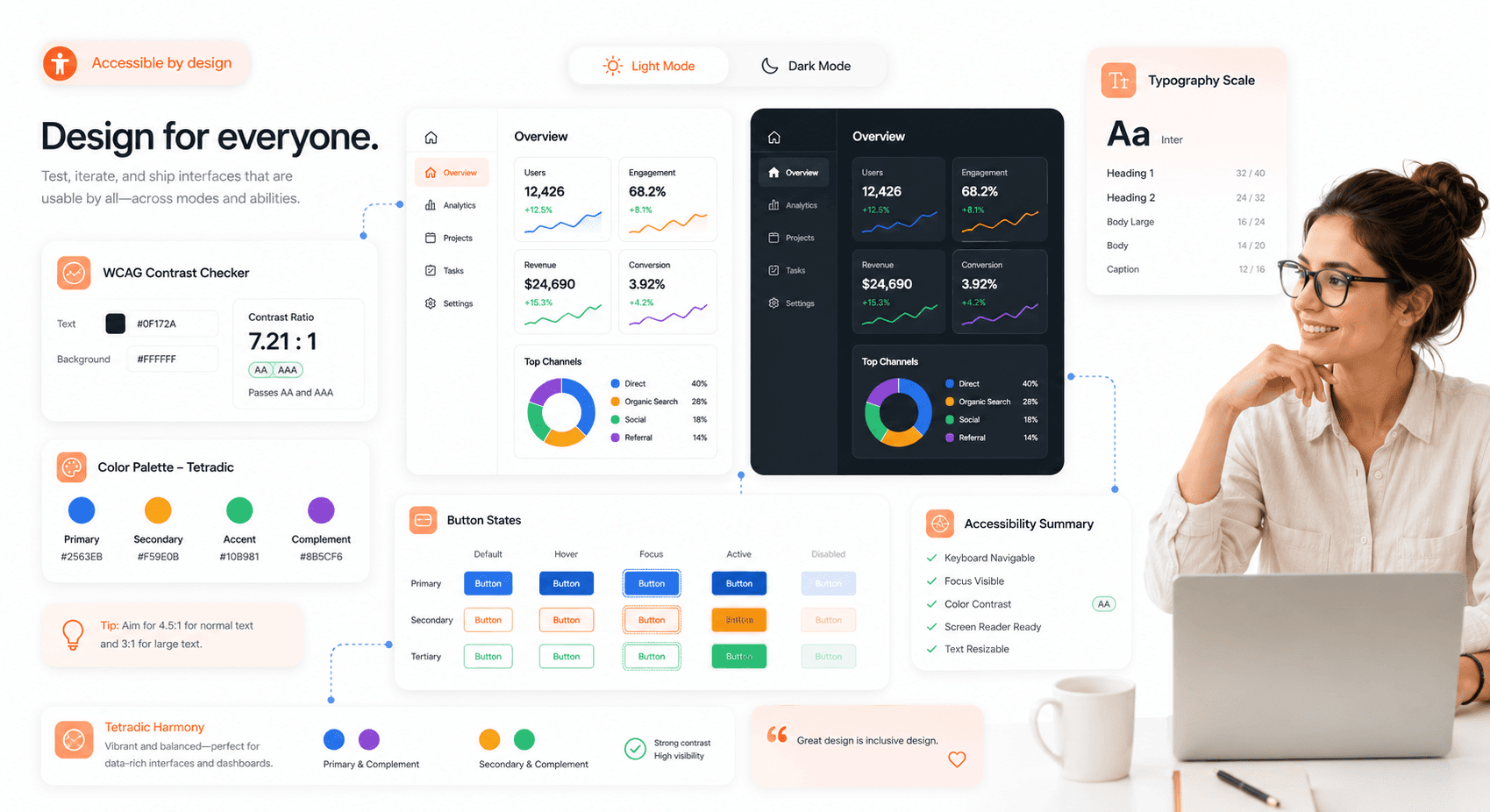
Never treat all four colors equally. The key to a harmonious tetradic palette is to establish a clear visual hierarchy. Select one color to be your dominant hue, which should cover approximately 60% of your design. This color will often serve as the primary background or the main brand color. The other three colors should act as secondary and accent colors, used more sparingly to highlight key elements. This is the 60-30-10 principle applied to a four-color system 60% dominant, 30% secondary, 10% accent and it's the single most reliable framework for preventing visual chaos in complex palettes.


Balance Warm and Cool Colors in Interfaces

A tetradic palette naturally includes both warm (reds, oranges, yellows) and cool (blues, greens, purples) colors. A successful design balances these to create a desired mood. A common strategy is to use cool colors for backgrounds and larger UI components to create a sense of calm and stability, while reserving warm colors for interactive elements like buttons and notifications to draw attention and prompt action.


Control Saturation and Brightness Levels

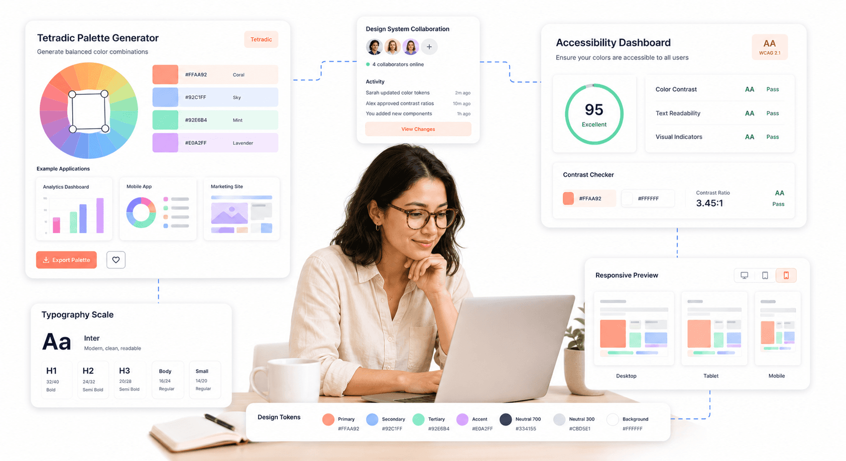
Your four chosen colors are just a starting point. Create a more sophisticated and cohesive palette by using different tints (adding white), shades (adding black), and tones (adding gray). Instead of using four highly saturated colors that compete with each other, use muted versions for backgrounds and less important elements, while saving the most vibrant versions for accents. An orange purple green and yellow palette, for example, can be softened by using a muted green for the background, a light yellow for highlights, and a vibrant orange for the primary CTA.


Use Neutral Colors to Stabilize Layouts

Neutral colors—like white, gray, and black—are your secret weapon for taming a vibrant tetradic palette. They provide visual breathing room and prevent the design from becoming overwhelming. Use neutrals for typography, containers, and negative space. A clean, neutral background can make your tetradic colors pop without creating visual noise, ensuring your design feels polished and professional.


Define Clear Color Roles in UI Systems

To maintain consistency and create an intuitive user experience, assign a specific function to each color in your palette. For example:

  • Dominant Color (Cool): Backgrounds, main layout structure.


  • Secondary Color (Cool): Secondary navigation, card backgrounds.


  • Primary Accent (Warm): CTAs, active states, important icons.


  • Secondary Accent (Warm): Notifications, alerts, status indicators.


By creating a system and sticking to it, you ensure that your design is not only beautiful but also functional and easy to navigate.


Implementing these structured UI roles across scalable SaaS applications often requires adopting a custom CSS framework development approach that aligns design systems with reusable frontend architecture.


For a production-grade role taxonomy, study the Material Design 3 color role system — primary, secondary, tertiary, surface, and error roles map cleanly onto a four-color tetradic structure.


Ensure UX Color Accessibility Compliance

A beautiful design is useless if it's not accessible — especially in regulated environments where WCAG-compliant color systems for safety-critical interfaces are non-negotiable. Vibrant color combinations can sometimes fail to meet web accessibility standards, particularly for text contrast. Use tools like the WCAG color contrast checker to ensure that your text is readable against its background.


When operationalizing this in code, compare React UI component libraries that support tetradic theming so your design tokens translate cleanly into shipped components.


In 2026, AI-driven UX design workflows for SaaS have made accessibility checks significantly easier — platforms like Adobe Color and Stark can now automatically flag contrast failures across your entire palette and suggest compliant alternatives in seconds. There's no reason to ship an accessibility issue when the tooling catches it before you do. Pay special attention to text on colored buttons and links. This not only makes your product usable for people with visual impairments but also improves the experience for all users in various lighting conditions.

“Accessible SaaS design system demonstrating WCAG contrast checks and tetradic palette optimization across light mode and dark mode interfaces.”

Optimize Tetradic Colors for Light and Dark Mode

In 2026, dark mode is a baseline expectation not a feature, not an option. Every color decision you make needs to work in both themes from day one, not be retrofitted after launch. Your tetradic color scheme must be flexible enough to work effectively in both modes. This may require adjusting the saturation and brightness of your colors. A color that works well as a background in light mode might be too dominant in dark mode. Test your palette extensively in both themes to ensure it remains balanced, readable, and visually appealing.


Real-World Examples of Tetradic Color Combinations

Many successful brands have embraced complex color palettes to create memorable and effective user experiences.

  • Google: Perhaps the most famous example, Google’s logo and product ecosystem use a palette of red, yellow, green, and blue. This scheme communicates approachability, innovation, and the diversity of information it organizes. In their UI, these colors are used functionally to guide users and differentiate products.


  • Slack: The communication platform uses a vibrant palette that includes purple, green, blue, and yellow-orange. This playful yet professional scheme reflects the brand's mission to make work life simpler and more pleasant. The colors are used strategically within the app to denote statuses, channels, and notifications.


  • Microsoft: The iconic Windows logo uses a tetradic color scheme to represent the different facets of its operating system. This approach creates a sense of integration and diversity within its product family, from business tools to creative software.


  • eBay: The online marketplace uses red, blue, yellow, and green to convey a sense of energy, variety, and excitement, reflecting the dynamic nature of its platform where millions of items are bought and sold.


Tools for Building and Testing Tetradic Color Schemes

You don't have to create your tetradic palettes from scratch. Several powerful tools can help you generate, test, and refine your color choices.

  • Adobe Color: Adobe Color is a comprehensive tool that allows you to create color schemes based on different harmony rules, including tetradic. You can explore palettes created by other designers, extract themes from images, and check for accessibility.


  • Coolors: Coolors palette generator is a fast and intuitive palette generator. You can quickly generate random palettes, lock colors you like, and adjust hues, saturation, and brightness. It's an excellent tool for rapid brainstorming.


  • Khroma: Khroma is an AI-powered tool that learns your color preferences and generates personalized palettes. In 2026, AI palette tools have matured significantly — see how AI UI generation is reshaping product design — the better ones now automatically adjust suggestions for accessibility compliance and predict how colors will perform across light and dark modes.


  • Figma / Penpot: Don't evaluate your palette in swatch previews alone. Both tools let you test colors directly on real UI components buttons, cards, navigation, typography which is where palette problems actually reveal themselves. A swatch that looks balanced often breaks the moment real content is applied.


“Professional UI/UX designer using modern color palette tools and floating SaaS design system interfaces for tetradic palette creation.”


Final Thoughts on Visual Design Color Balance

The tetradic color scheme is a powerful tool for any UI/UX designer looking to create visually rich and dynamic digital products. While it presents unique challenges, mastering it can elevate your designs from good to unforgettable. By establishing a clear hierarchy, balancing warm and cool tones, and assigning strategic roles to each color, you can build interfaces that are not only beautiful but also intuitive and accessible.


Remember to start with a dominant color, use neutrals to provide balance, and always test for readability. With practice and a systematic approach, you can confidently solve your audience's pain points and deliver designs that are both professional and inspiring.


What are your thoughts on using tetradic colors in UI design? Share your favorite examples in the comments below!


Ready to transform your product's visual identity? Partner with Hashbyt to craft scalable, AI-first frontend experiences that drive engagement and growth.

Share:

Is Your Product's UI Costing You Customers?

your product

Competitor

Free Competitive UI Audit.

See the Exact Screens Where Users Lose Confidence.

Visual Comparison Against Your Top 2 Competitors.

Modernise Your Product Without Rebuilding It.

Stop Losing Deals to Products That Just Feel Easier to Use

▶︎

Identify UX friction hurting demo conversion

▶︎

Improve onboarding without disrupting your roadmap

Stop Losing Deals to Products That Just Feel Easier to Use

▶︎

Identify UX friction hurting demo conversion

▶︎

Improve onboarding without disrupting your roadmap

Frequently Asked Questions

We're ready to answer your questions

Slow releases, clunky dashboards, and frustrated users? You've got questions about how to fix them. We have the Frontend-First answers that unlock growth. Let's talk solutions.

Stop Losing Deals to Products That Just Feel Easier to Use

▶︎

Identify UX friction hurting demo conversion

▶︎

Improve onboarding without disrupting your roadmap

The core difference lies in the number of colors and the resulting complexity. A triadic scheme uses three colors that are evenly spaced around the color wheel, forming a triangle. It offers a vibrant look but is generally simpler and more cohesive to balance . A tetradic (or double-complementary) scheme uses four colors, forming two pairs of complementary colors in a rectangle on the wheel . This makes it the richest and most versatile scheme, but also the most challenging to harmonize, as it requires careful management of contrast and color roles to avoid visual chaos.

Answer

What is the difference between a tetradic and a triadic color scheme?

Question

Several major companies use tetradic schemes to create vibrant and memorable brand identities. Google is perhaps the most famous example, using a palette of red, blue, yellow, and green to convey diversity, innovation, and approachability . Microsoft also employs a tetradic scheme in its Windows branding, using color to represent its diverse product offerings and create a modern, accessible feel . Other notable examples include eBay, whose red, blue, yellow, and green palette reflects its dynamic marketplace, and NBC with its iconic peacock logo.

Answer

What are some famous examples of brands using tetradic color schemes?

Question

Absolutely. While tetradic schemes are vibrant, they can be adapted for professional contexts by focusing on sophistication over loudness. The key is to use more muted or desaturated versions of the colors . For example, instead of bright primary colors, use deeper burgundies, forest greens, navy blues, and mustard yellows. Furthermore, leaning heavily on neutral backgrounds like white, gray, or off-black can ground the vibrant colors and create a polished, trustworthy interface suitable for fintech, SaaS, or corporate websites.

Answer

Can a tetradic color scheme be used for professional or corporate designs?

Question

In a tetradic palette, no single color is naturally dominant, so you must make a strategic choice to establish a clear hierarchy and prevent the colors from competing visually. Your decision should be guided by several key factors. First, align the dominant color with your primary brand color to reinforce brand identity. Second, consider the mood you wish to evoke; for instance, a calm blue might be ideal for a fintech app, while an energetic orange could be perfect for an entertainment platform. Finally, consider the color's function, as the dominant hue is typically applied to about 60% of the interface, serving as the foundational tone for backgrounds and large surface areas to anchor the entire design.

Answer

How do I choose which color should be dominant in a tetradic palette?

Question

The 60-30-10 rule is a classic design principle for creating balanced and visually comfortable color proportions. It provides a simple framework for distributing colors across a design: 60% of the space is dedicated to a dominant color, which acts as the main hue for elements like backgrounds. A secondary color occupies 30% of the space, supporting the main color in areas such as navigation bars or card backgrounds. The final 10% is reserved for an accent color, used sparingly to make key interactive elements like buttons and alerts stand out. When applying this rule to a tetradic scheme with four colors, you assign one color to the 60% role, another to the 30% role, and then strategically use the two remaining colors within the 10% accent space to create highlights and visual interest without overwhelming the composition.

Answer

What is the 60-30-10 rule, and how does it apply to a tetradic scheme?

Question

Frequently Asked Questions

We're ready to answer your questions

Slow releases, clunky dashboards, and frustrated users? You've got questions about how to fix them. We have the Frontend-First answers that unlock growth. Let's talk solutions.

The core difference lies in the number of colors and the resulting complexity. A triadic scheme uses three colors that are evenly spaced around the color wheel, forming a triangle. It offers a vibrant look but is generally simpler and more cohesive to balance . A tetradic (or double-complementary) scheme uses four colors, forming two pairs of complementary colors in a rectangle on the wheel . This makes it the richest and most versatile scheme, but also the most challenging to harmonize, as it requires careful management of contrast and color roles to avoid visual chaos.

Answer

What is the difference between a tetradic and a triadic color scheme?

Question

Several major companies use tetradic schemes to create vibrant and memorable brand identities. Google is perhaps the most famous example, using a palette of red, blue, yellow, and green to convey diversity, innovation, and approachability . Microsoft also employs a tetradic scheme in its Windows branding, using color to represent its diverse product offerings and create a modern, accessible feel . Other notable examples include eBay, whose red, blue, yellow, and green palette reflects its dynamic marketplace, and NBC with its iconic peacock logo.

Answer

What are some famous examples of brands using tetradic color schemes?

Question

Absolutely. While tetradic schemes are vibrant, they can be adapted for professional contexts by focusing on sophistication over loudness. The key is to use more muted or desaturated versions of the colors . For example, instead of bright primary colors, use deeper burgundies, forest greens, navy blues, and mustard yellows. Furthermore, leaning heavily on neutral backgrounds like white, gray, or off-black can ground the vibrant colors and create a polished, trustworthy interface suitable for fintech, SaaS, or corporate websites.

Answer

Can a tetradic color scheme be used for professional or corporate designs?

Question

In a tetradic palette, no single color is naturally dominant, so you must make a strategic choice to establish a clear hierarchy and prevent the colors from competing visually. Your decision should be guided by several key factors. First, align the dominant color with your primary brand color to reinforce brand identity. Second, consider the mood you wish to evoke; for instance, a calm blue might be ideal for a fintech app, while an energetic orange could be perfect for an entertainment platform. Finally, consider the color's function, as the dominant hue is typically applied to about 60% of the interface, serving as the foundational tone for backgrounds and large surface areas to anchor the entire design.

Answer

How do I choose which color should be dominant in a tetradic palette?

Question

The 60-30-10 rule is a classic design principle for creating balanced and visually comfortable color proportions. It provides a simple framework for distributing colors across a design: 60% of the space is dedicated to a dominant color, which acts as the main hue for elements like backgrounds. A secondary color occupies 30% of the space, supporting the main color in areas such as navigation bars or card backgrounds. The final 10% is reserved for an accent color, used sparingly to make key interactive elements like buttons and alerts stand out. When applying this rule to a tetradic scheme with four colors, you assign one color to the 60% role, another to the 30% role, and then strategically use the two remaining colors within the 10% accent space to create highlights and visual interest without overwhelming the composition.

Answer

What is the 60-30-10 rule, and how does it apply to a tetradic scheme?

Question

Stop Losing Deals to Products That Just Feel Easier to Use

▶︎

Identify UX friction hurting demo conversion

▶︎

Improve onboarding without disrupting your roadmap

Frequently Asked Questions

We're ready to answer your questions

Slow releases, clunky dashboards, and frustrated users? You've got questions about how to fix them. We have the Frontend-First answers that unlock growth. Let's talk solutions.

The core difference lies in the number of colors and the resulting complexity. A triadic scheme uses three colors that are evenly spaced around the color wheel, forming a triangle. It offers a vibrant look but is generally simpler and more cohesive to balance . A tetradic (or double-complementary) scheme uses four colors, forming two pairs of complementary colors in a rectangle on the wheel . This makes it the richest and most versatile scheme, but also the most challenging to harmonize, as it requires careful management of contrast and color roles to avoid visual chaos.

Answer

What is the difference between a tetradic and a triadic color scheme?

Question

Several major companies use tetradic schemes to create vibrant and memorable brand identities. Google is perhaps the most famous example, using a palette of red, blue, yellow, and green to convey diversity, innovation, and approachability . Microsoft also employs a tetradic scheme in its Windows branding, using color to represent its diverse product offerings and create a modern, accessible feel . Other notable examples include eBay, whose red, blue, yellow, and green palette reflects its dynamic marketplace, and NBC with its iconic peacock logo.

Answer

What are some famous examples of brands using tetradic color schemes?

Question

Absolutely. While tetradic schemes are vibrant, they can be adapted for professional contexts by focusing on sophistication over loudness. The key is to use more muted or desaturated versions of the colors . For example, instead of bright primary colors, use deeper burgundies, forest greens, navy blues, and mustard yellows. Furthermore, leaning heavily on neutral backgrounds like white, gray, or off-black can ground the vibrant colors and create a polished, trustworthy interface suitable for fintech, SaaS, or corporate websites.

Answer

Can a tetradic color scheme be used for professional or corporate designs?

Question

In a tetradic palette, no single color is naturally dominant, so you must make a strategic choice to establish a clear hierarchy and prevent the colors from competing visually. Your decision should be guided by several key factors. First, align the dominant color with your primary brand color to reinforce brand identity. Second, consider the mood you wish to evoke; for instance, a calm blue might be ideal for a fintech app, while an energetic orange could be perfect for an entertainment platform. Finally, consider the color's function, as the dominant hue is typically applied to about 60% of the interface, serving as the foundational tone for backgrounds and large surface areas to anchor the entire design.

Answer

How do I choose which color should be dominant in a tetradic palette?

Question

The 60-30-10 rule is a classic design principle for creating balanced and visually comfortable color proportions. It provides a simple framework for distributing colors across a design: 60% of the space is dedicated to a dominant color, which acts as the main hue for elements like backgrounds. A secondary color occupies 30% of the space, supporting the main color in areas such as navigation bars or card backgrounds. The final 10% is reserved for an accent color, used sparingly to make key interactive elements like buttons and alerts stand out. When applying this rule to a tetradic scheme with four colors, you assign one color to the 60% role, another to the 30% role, and then strategically use the two remaining colors within the 10% accent space to create highlights and visual interest without overwhelming the composition.

Answer

What is the 60-30-10 rule, and how does it apply to a tetradic scheme?

Question

About the author

Author:

|

Founder of

I’m the founder of Hashbyt, an AI-first frontend and UI/UX SaaS partner helping 200+ SaaS companies scale faster through intelligent, growth-driven design. My work focuses on building modern frontend systems, design frameworks, and product modernization strategies that boost revenue, improve user adoption, and help SaaS founders turn their UI into a true growth engine.

Follow the expert:

Is a clunky UI holding back your growth?

Is a clunky UI holding back your growth?

▶︎

Transform slow, frustrating dashboards into intuitive interfaces that ensure effortless user adoption.

▶︎

Transform slow, frustrating dashboards into intuitive interfaces that ensure effortless user adoption.